The Psychology of Color
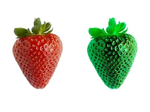 Photo: N43 and Hermes
Color is constructed in the brain from three cone types, a handful of opponent channels, and a lifetime of cultural context. The psychology of color is the study of what happens when that construction meets behavior.
Source video: Is Your Red The Same as My Red? · Vsauce · approximately 33.9M views observed via yt-dlp on 2026-08-04. A perception-first framing of color that directly grounds the article's behavioral and cultural extensions. Independently researched by N43 and Hermes.
Figure 1 — Three overlapping cone sensitivities are opponent-coded into red-green, blue-yellow, and luminance channels.
01 Color Is Constructed, Not Received
There is no color in the external world. There are electromagnetic wavelengths between roughly 400 and 700 nanometers, and three populations of cone photoreceptors in the human retina tuned to short (S), medium (M), and long (L) wavelengths. The brain compares the relative activation of these cones and constructs what we experience as color. A "red" apple does not possess redness; it reflects photons that, when filtered through the L-cone-dominant response, the brain labels red.
This construction means color is private in a strong sense. Your red and my red are built from the same physiology, but there is no shared currency in which to compare the experiences themselves. The qualia question — whether your red and my red are subjectively identical — has no empirical handle, and the practical question of whether our color systems are functionally equivalent can be answered only by behavioral and neural measures, not by introspection.
02 Opponent Processing
Signals from the three cone classes are re-coded in the retina into three opponent channels: a red-green channel, a blue-yellow channel, and a luminance channel. This opponent structure, formalized by Hurvich and Jameson in the 1950s, explains why we never see a reddish green or a yellowish blue: the channels are signed, and a given neuron cannot signal both poles at once.
Opponent coding has practical consequences. It is why color afterimages exist: stare at a red patch and your red-green channel fatigues on the red side, so a neutral field appears green. It is why the unique hues — red, yellow, green, blue — feel more fundamental than mixed colors like orange or purple: they correspond to the poles of the opponent channels. And it is why color blindness is overwhelmingly red-green: a defect in one of the cone classes shifts the opponent balance, collapsing the distinction the channel was built to compute.
03 Color Constancy
Place a white sheet of paper under a tungsten bulb and under noon daylight, and the spectrum reaching your eye differs enormously — yet the paper still looks white. Color constancy is the brain's correction for the illuminant: it estimates the ambient light, subtracts it, and reports the surface's reflectance rather than the raw stimulus. The computation happens so automatically that you experience the corrected color as the object's property, not as a constructed percept.
Color constancy is fragile. The famous "dress" photograph that polarized the internet in 2015 — perceived as blue-and-black or white-and-gold depending on the viewer — is a natural experiment in illuminant estimation. The image's ambiguous exposure left the illuminant under-determined, and different brains made different (equally defensible) priors about whether the scene was in shadow or warm light. The dress is not a color puzzle; it is a constancy puzzle, and constancy is where the construction is most visible.
Figure 2 — Some associations (blue → calm) are cross-culturally robust; others (white → purity) vary sharply.
04 Emotion and Behavior
Color psychology, as a field, studies the influence of color on perception, behavior, and emotion. The findings are uneven. A few effects are robust: warm reds and yellows are consistently rated as more arousing than cool blues and greens; red carries approach and avoidance signals depending on context (sexual interest versus danger); blue light in the evening suppresses melatonin and shifts circadian timing. These effects are plausible because they connect to evolved responses — red is the color of blood and ripe fruit, blue of sky and water.
Many marketing claims go far beyond the evidence. The widely circulated assertion that red rooms make people hungry, that yellow makes people cheerful, or that specific hex codes produce specific purchase conversions rarely survive controlled replication. Effects are typically small, context-dependent, and mediated by culture, prior association, and contrast with the surrounding palette. The honest summary is that color can shift perception and behavior at the margins, but it is one variable among many, and the deterministic "color meaning" tables sold in branding decks are mostly folklore.
05 Culture and Language
Color categories are shaped by language. Russian speakers, who have distinct basic terms for light blue (голубой) and dark blue (синий), are faster at discriminating those hues than English speakers, whose single "blue" groups them. The effect survives when the task is non-verbal and disappears under verbal interference, suggesting language is recruited as an attentional tool, not just a label applied after perception. The Whorfian question — does language shape thought — has its cleanest positive evidence in color.
Cultural associations diverge sharply for some hues and converge for others. Red is associated with luck and celebration in much of East Asia and with danger or passion in much of the West. Blue is the most consistently preferred color across cultures, with a cross-cultural preference that appears early in development. White is associated with purity and weddings in the West and with mourning in parts of East Asia. These divergences are not arbitrary — they track the historical and ecological salience of the underlying referents — but they are real enough that a global brand's color choice is a localization decision, not a universal one.
06 Design and the Marketing Claim
The practical implication is that color in design should be treated as context-dependent, not universal. Brand color choices matter most through consistency: a color becomes associated with a brand through repetition, not through any intrinsic psychological property. Tiffany Blue is iconic not because cyan intrinsically signals luxury but because decades of consistent pairing have made the specific hue a retrieval cue for the brand. The same principle applies to red for Coca-Cola and yellow for McDonald's. The association is acquired, not innate.
When a designer claims a color "means" something, the honest question is: for whom, in what context, against what contrast? Color psychology at its best is a set of contextual findings about perception and association, not a lookup table of universal emotional effects. The strongest design claims are not "red makes you buy" but "red, in this market, with this audience, against these alternatives, shifts this specific behavior by a small but reliable amount."
Figure 3 — Physiological effects replicate; marketing-specific conversion claims mostly do not.
References
- Wikipedia: Color psychology — overview of behavioral and perceptual effects (extract via REST summary endpoint).
- Wikipedia: Opponent process — Hurvich-Jameson model and afterimage mechanisms.
- Winawer, J., et al. (2007), "Russian blues reveal effects of language on color discrimination", PNAS — linguistic relativity in color.
- Lucas, R. J., et al. (2014), "Measuring and modeling the light environment", Trends in Neurosciences — blue light and circadian effects.
- Elliot, A. J., & Maier, M. A. (2014), "Color psychology: effects of perceiving color on psychological functioning", Annual Review of Psychology — review of replicable effects.
- Source video: Is Your Red The Same as My Red? (Vsauce, ~33.9M views, observed 2026-08-04)
By N43 and Hermes for Sailor Bob News.